
Client
Vault Mental Health
Scope
Logo Design
Brand Guidelines
Role
Brand Identity & Design Direction
Vault Mental Health needed a refreshed identity that felt calm, professional, and distinct. The goal was to create a recognizable brand system that preserved familiarity while giving the practice a more polished and cohesive visual presence.
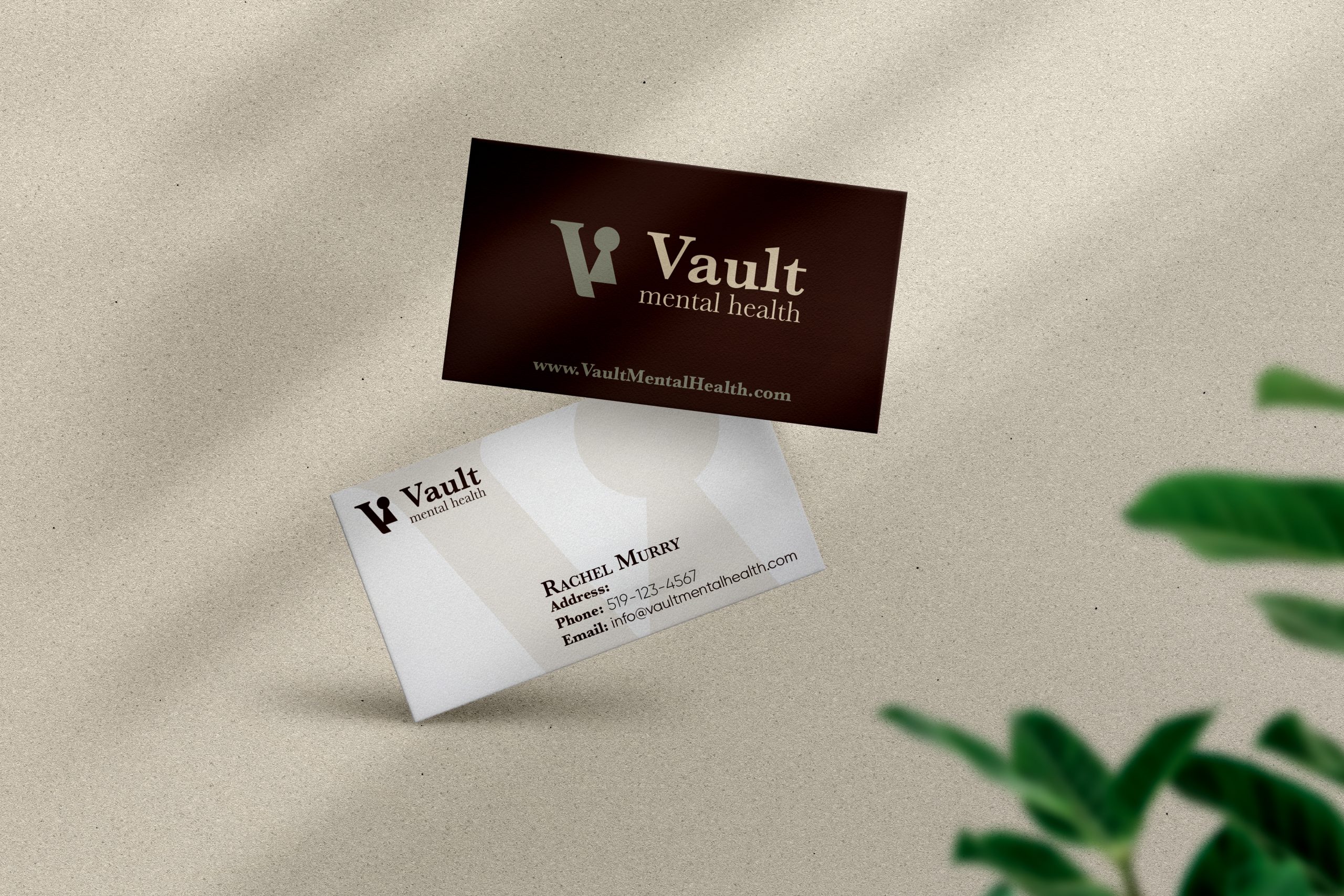
Vault Mental Health is an award-winning psychotherapy practice that needed a refreshed brand identity. Their original logo closely resembled a competitor’s, creating confusion and diluting their brand presence. They wanted something modern and recognizable, while still preserving the familiarity clients had with their brand.

I began with a strategic discovery phase: researching their services, understanding their differentiators, and sending a questionnaire to clarify brand goals and personality. From there, I explored competitor branding and gathered visual inspiration to build a direction.
Using those insights, I developed moodboards and logo sketches that carefully balanced professionalism with warmth. Vault reviewed a selection of refined options and provided feedback that helped guide revisions toward a final logo concept.

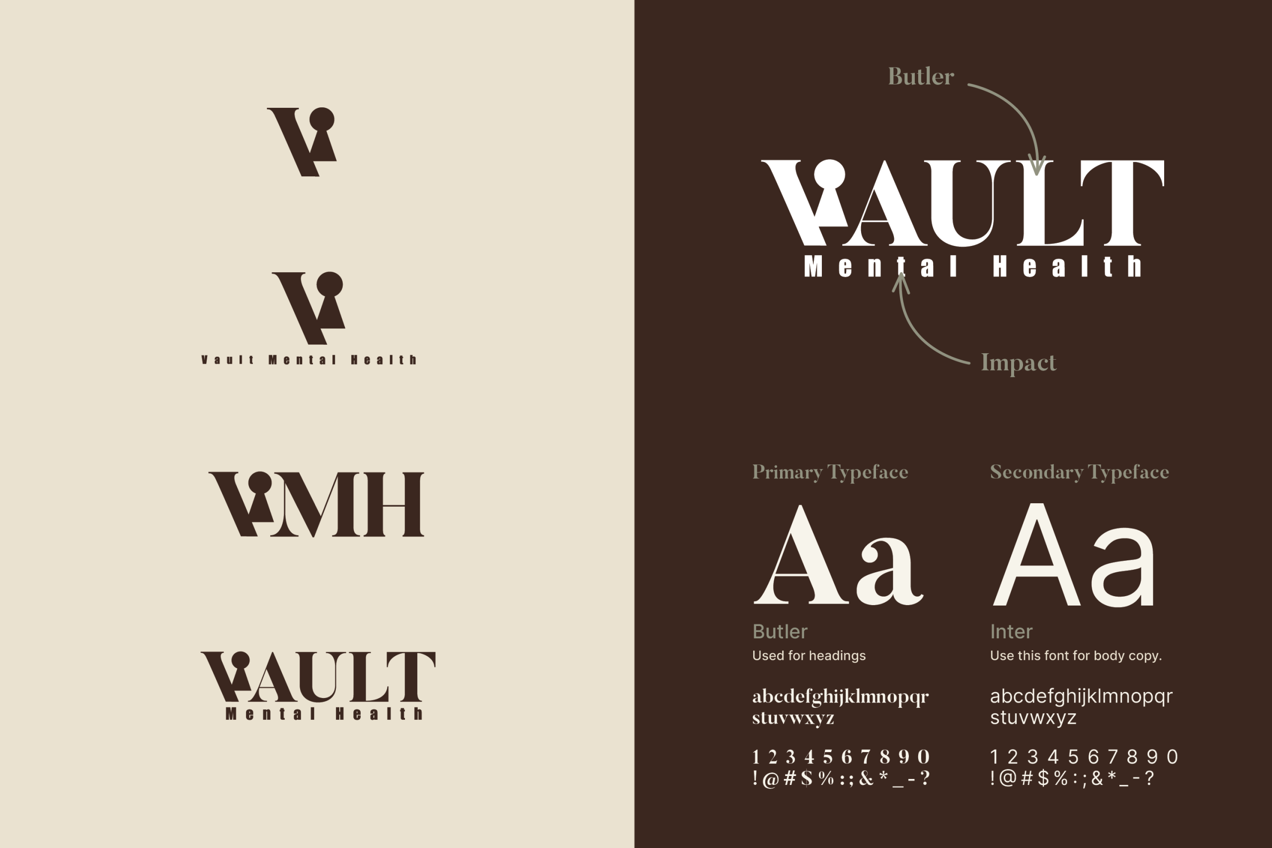
The final design centers around a stylized “V” with a keyhole icon symbolizing security, trust, and private access to care. It nods subtly to the therapy rooms while reinforcing the brand’s values of confidentiality and support. The visual system paired calming tones with modern typography for a clean, reassuring feel.
The final design delivered a clearer, more engaging web experience tailored to VendorPM’s multiple user types. The site now reflects the scale and professionalism of the platform—while helping drive better-qualified leads through a focused, user-friendly interface.